
SHAP Values for TimeGPT and TimeGEN
SHAP (SHapley Additive exPlanation) values use game theory to explain the output of any machine learning model. It allows us to explore in detail how exogenous features impact the final forecast, both at a single forecast step or over the entire horizon.
When you forecast with exogenous features, you can access the SHAP values for all series at each prediction step, and use the popular shap Python package to make different plots and explain the impact of the features.
This tutorial assumes knowledge on forecasting with exogenous features, so make sure to read our tutorial on exogenous variables. Also, the shap package must be installed separately as it is not a dependency of nixtla.
shap can be installed from either PyPI or conda-forge:
pip install shap

or

conda install -c conda-forge shap
For the official documentation of SHAP, visit: https://shap.readthedocs.io/en/latest/
![]()
1. Import packages
First, we import the required packages and initialize the Nixtla client.
import pandas as pd
from nixtla import NixtlaClient
nixtla_client = NixtlaClient(
    # defaults to os.environ.get("NIXTLA_API_KEY")
    api_key = 'my_api_key_provided_by_nixtla'
)
Use an Azure AI endpoint
To use an Azure AI endpoint, remember to set also the
base_urlargument:
nixtla_client = NixtlaClient(base_url="you azure ai endpoint", api_key="your api_key")
2. Load data
In this example on SHAP values, we will use exogenous variables (also known as covariates) to improve the accuracy of electricity market forecasts. We’ll work with a well-known dataset called EPF, which is publicly accessible here.
This dataset includes data from five different electricity markets, each with unique price dynamics, such as varying frequencies and occurrences of negative prices, zeros, and price spikes. Since electricity prices are influenced by exogenous factors, each dataset also contains two additional time series: day-ahead forecasts of two significant exogenous factors specific to each market.
For simplicity, we will focus on the Belgian electricity market (BE). This dataset includes hourly prices (y), day-ahead forecasts of load (Exogenous1), and electricity generation (Exogenous2). It also includes one-hot encoding to indicate whether a specific date is a specific day of the week. Eg.: Monday (day_0 = 1), a Tuesday (day_1 = 1), and so on.
If your data depends on exogenous factors or covariates such as prices, discounts, special holidays, weather, etc., you can follow a similar structure.
market = "BE"
df = pd.read_csv('https://raw.githubusercontent.com/Nixtla/transfer-learning-time-series/main/datasets/electricity-short-with-ex-vars.csv')
df.head()
| unique_id | ds | y | Exogenous1 | Exogenous2 | day_0 | day_1 | day_2 | day_3 | day_4 | day_5 | day_6 | |
|---|---|---|---|---|---|---|---|---|---|---|---|---|
| 0 | BE | 2016-10-22 00:00:00 | 70.00 | 57253.0 | 49593.0 | 0.0 | 0.0 | 0.0 | 0.0 | 0.0 | 1.0 | 0.0 |
| 1 | BE | 2016-10-22 01:00:00 | 37.10 | 51887.0 | 46073.0 | 0.0 | 0.0 | 0.0 | 0.0 | 0.0 | 1.0 | 0.0 |
| 2 | BE | 2016-10-22 02:00:00 | 37.10 | 51896.0 | 44927.0 | 0.0 | 0.0 | 0.0 | 0.0 | 0.0 | 1.0 | 0.0 |
| 3 | BE | 2016-10-22 03:00:00 | 44.75 | 48428.0 | 44483.0 | 0.0 | 0.0 | 0.0 | 0.0 | 0.0 | 1.0 | 0.0 |
| 4 | BE | 2016-10-22 04:00:00 | 37.10 | 46721.0 | 44338.0 | 0.0 | 0.0 | 0.0 | 0.0 | 0.0 | 1.0 | 0.0 |
3. Forecasting electricity prices using exogenous variables
To produce forecasts we also have to add the future values of the exogenous variables.
If your forecast depends on other variables, it is important to ensure that those variables are available at the time of forecasting. In this example, we know that the price of electricity depends on the demand (Exogenous1) and the quantity produced (Exogenous2). Thus, we need to have those future values available at the time of forecasting. If those values were not available, we can always use TimeGPT to forecast them.
Here, we read a dataset that contains the future values of our features. In this case, we want to predict 24 steps ahead, therefore each unique_id will have 24 observations.
Important
If you want to use exogenous variables when forecasting with TimeGPT, you need to have the future values of those exogenous variables too.
future_ex_vars_df = pd.read_csv('https://raw.githubusercontent.com/Nixtla/transfer-learning-time-series/main/datasets/electricity-short-future-ex-vars.csv')
future_ex_vars_df.head()
| unique_id | ds | Exogenous1 | Exogenous2 | day_0 | day_1 | day_2 | day_3 | day_4 | day_5 | day_6 | |
|---|---|---|---|---|---|---|---|---|---|---|---|
| 0 | BE | 2016-12-31 00:00:00 | 70318.0 | 64108.0 | 0.0 | 0.0 | 0.0 | 0.0 | 0.0 | 1.0 | 0.0 |
| 1 | BE | 2016-12-31 01:00:00 | 67898.0 | 62492.0 | 0.0 | 0.0 | 0.0 | 0.0 | 0.0 | 1.0 | 0.0 |
| 2 | BE | 2016-12-31 02:00:00 | 68379.0 | 61571.0 | 0.0 | 0.0 | 0.0 | 0.0 | 0.0 | 1.0 | 0.0 |
| 3 | BE | 2016-12-31 03:00:00 | 64972.0 | 60381.0 | 0.0 | 0.0 | 0.0 | 0.0 | 0.0 | 1.0 | 0.0 |
| 4 | BE | 2016-12-31 04:00:00 | 62900.0 | 60298.0 | 0.0 | 0.0 | 0.0 | 0.0 | 0.0 | 1.0 | 0.0 |
Let’s call the forecast method, adding this information. To access the SHAP values, we also need to specify feature_contributions=True in the forecast method.
timegpt_fcst_ex_vars_df = nixtla_client.forecast(df=df,
                                                 X_df=future_ex_vars_df,
                                                 h=24,
                                                 level=[80, 90],
                                                 feature_contributions=True)
timegpt_fcst_ex_vars_df.head()
INFO:nixtla.nixtla_client:Validating inputs...
INFO:nixtla.nixtla_client:Inferred freq: h
INFO:nixtla.nixtla_client:Querying model metadata...
INFO:nixtla.nixtla_client:Preprocessing dataframes...
INFO:nixtla.nixtla_client:Using future exogenous features: ['Exogenous1', 'Exogenous2', 'day_0', 'day_1', 'day_2', 'day_3', 'day_4', 'day_5', 'day_6']
INFO:nixtla.nixtla_client:Calling Forecast Endpoint...
| unique_id | ds | TimeGPT | TimeGPT-hi-80 | TimeGPT-hi-90 | TimeGPT-lo-80 | TimeGPT-lo-90 | |
|---|---|---|---|---|---|---|---|
| 0 | BE | 2016-12-31 00:00:00 | 51.632830 | 61.598820 | 66.088295 | 41.666843 | 37.177372 |
| 1 | BE | 2016-12-31 01:00:00 | 45.750877 | 54.611988 | 60.176445 | 36.889767 | 31.325312 |
| 2 | BE | 2016-12-31 02:00:00 | 39.650543 | 46.256210 | 52.842808 | 33.044876 | 26.458277 |
| 3 | BE | 2016-12-31 03:00:00 | 34.000072 | 44.015310 | 47.429000 | 23.984835 | 20.571144 |
| 4 | BE | 2016-12-31 04:00:00 | 33.785370 | 43.140503 | 48.581240 | 24.430239 | 18.989498 |
4. Extract SHAP values
Now that we have made predictions using exogenous features, we can then extract the SHAP values to understand their relevance using the feature_contributions attribute of the client. This returns a DataFrame containing the SHAP values and base values for each series, at each step in the horizon.
shap_df = nixtla_client.feature_contributions
shap_df = shap_df.query("unique_id == @market")
shap_df.head()
| unique_id | ds | TimeGPT | Exogenous1 | Exogenous2 | day_0 | day_1 | day_2 | day_3 | day_4 | day_5 | day_6 | base_value | |
|---|---|---|---|---|---|---|---|---|---|---|---|---|---|
| 0 | BE | 2016-12-31 00:00:00 | 51.632830 | 27.929638 | -16.363607 | 0.081917 | -1.883555 | 0.346484 | -0.228611 | 0.424167 | -3.411662 | 1.113910 | 43.624146 |
| 1 | BE | 2016-12-31 01:00:00 | 45.750877 | 17.678530 | -12.240089 | -0.758545 | -0.077536 | -0.160390 | -0.309567 | 0.871469 | -3.927268 | 1.218714 | 43.455560 |
| 2 | BE | 2016-12-31 02:00:00 | 39.650543 | 21.632694 | -21.400244 | -0.926842 | -0.470276 | -0.022417 | -0.225389 | 0.220258 | -3.927268 | 1.145736 | 43.624290 |
| 3 | BE | 2016-12-31 03:00:00 | 34.000072 | 13.879354 | -20.681124 | -0.114050 | -0.488141 | 0.048164 | -0.126627 | 0.200692 | -3.400485 | 1.144959 | 43.537330 |
| 4 | BE | 2016-12-31 04:00:00 | 33.785370 | 13.465129 | -20.619830 | -0.036112 | -0.470496 | 0.048375 | -0.126627 | 0.200692 | -3.400485 | 1.144959 | 43.579760 |
In the Dataframe above, we can see that we have the SHAP values at every forecasting step, as well as the prediction from TimeGPT and the base value. Note that the base value is the prediction of the model if exogenous features were unknown.
Therefore, the forecast from TimeGPT is equal to the sum of the base value and the SHAP values of each exogenous feature in a given row.
5. Make plots using shap
shapNow that we have access to SHAP values we can use the shap package to make any plots that we want.
5.1 Bar plot
Here, let’s make bar plots for each series and their features, so we can see which features impacts the predictions the most.
import shap
import matplotlib.pyplot as plt

shap_columns = shap_df.columns.difference(['unique_id', 'ds', 'TimeGPT', 'base_value'])
shap_values = shap_df[shap_columns].values  # SHAP values matrix
base_values = shap_df['base_value'].values  # Extract base values
features = shap_columns  # Feature names

# Create a SHAP values object
shap_obj = shap.Explanation(values=shap_values, base_values=base_values, feature_names=features)

# Plot the bar plot for SHAP values
shap.plots.bar(shap_obj, max_display=len(features), show=False)
plt.title(f'SHAP values for {market}')
plt.show()
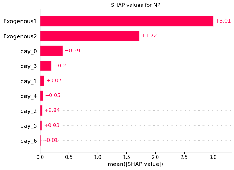
The plot above shows the average SHAP values for each feature across the entire horizon.
Here, we see that Exogenous1 is the most important feature, as it has the largest average contribution. Remember that it designates the expected energy demand, so we can see that this variable has a large impact on the final prediction. On the other hand, day_2 is the least important feature, since it has the lowest value.
5.2 Waterfall plot
Now, let’s see how we can make a waterfall plot to explore the the impact of features at a single prediction step. The code below selects a specific date. Of course, this can be modified for any series or date.
selected_ds = shap_df['ds'].min()

filtered_df = shap_df[shap_df['ds'] == selected_ds]

shap_values = filtered_df[shap_columns].values.flatten()
base_value = filtered_df['base_value'].values[0]
features = shap_columns

shap_obj = shap.Explanation(values=shap_values, base_values=base_value, feature_names=features)

shap.plots.waterfall(shap_obj, show=False)
plt.title(f'Waterfall Plot: {market}, date: {selected_ds}')
plt.show()
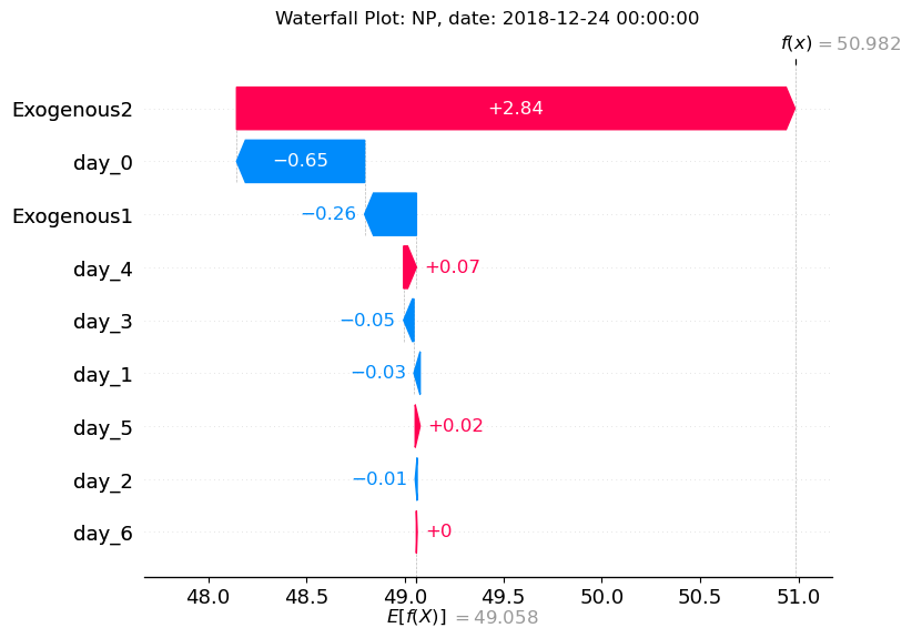
In the waterfall plot above, we can explore in more detail a single prediction. Here, we study the final prediction for the start of December 31th, 2016.
The x-axis represents the value of our series. At the bottom, we see E[f(X)] which represents the baseline value (the predicted value if exogenous features were unknown).
Then, we see how each feature has impacted the final forecast. Features like day_3, day_1, day_5, Exogenous2 all push the forecast to the left (smaller value). On the other hand, day_0, day_2, day_4, day_6 and Exogenous1 push it to the right (larger value).
Let’s think about this for a moment. In the introduction, we stated that Exogenous1 represents electricity load, whereas Exogenous2 represents electricity generation. * Exogenous1, the electricity load, adds positively to the overall prediction. This seems reasonable: if we expect a higher demand, we might expect the price to go up. * Exogenous2, on the other hand, adds negatively to the overall prediction. This seems reasonable too: if there’s a higher electricity generation, we expect the price to be lower. Hence, a negative contribution to the forecast for Exogenous2.
At the top right, we see f(x) which is the final output of the model after considering the impact of the exogenous features. Notice that this value corresponds to the final prediction from TimeGPT.
5.3 Heatmap
We can also do a heatmap plot to see how each feature impacts the final prediction. Here, we only need to select a specific series.
shap_columns = shap_df.columns.difference(['unique_id', 'ds', 'TimeGPT', 'base_value'])
shap_values = shap_df[shap_columns].values
feature_names = shap_columns.tolist()

shap_obj = shap.Explanation(values=shap_values, feature_names=feature_names)

shap.plots.heatmap(shap_obj, show=False)
plt.title(f'SHAP Heatmap (Unique ID: NP)')
plt.show()
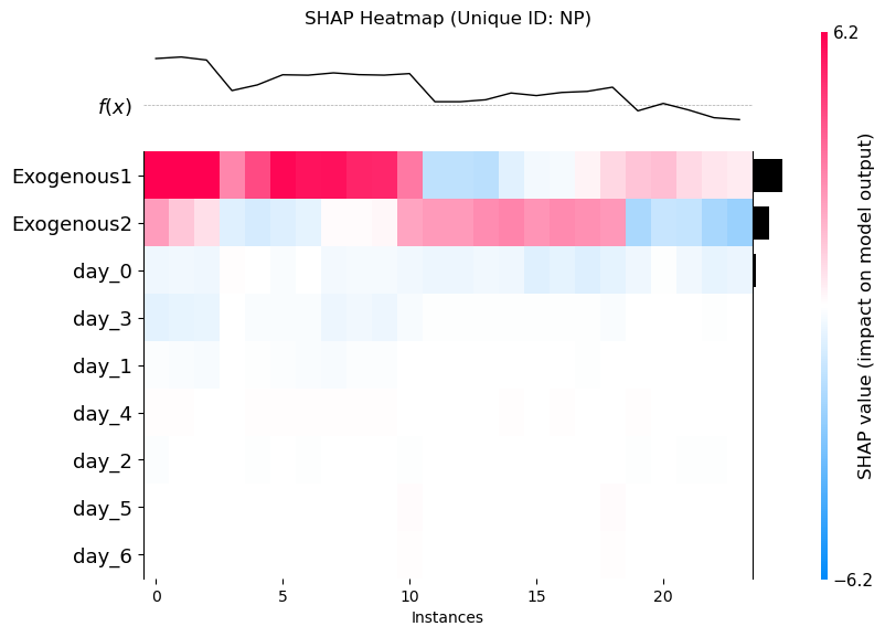
With the heatmap, we basically see a breakdown of each each feature impacts the final predciton at each timestep.
On the x-axis, we have the number of instances, which corresponds to the number of prediction steps (24 in this case, since our horizon is set to 24h). On the y-axis, we have the name of the exogenous features.
First, notice that the ordering is the same as in the bar plot, where Exogenous1 is the most important, and day_6 is the least important.
Then, the color of the heatmap indiciates if the feature tends to increase of decrease the final prediction at each forecasting step. For example, Exogenous1 always increases predictions across all 24 hours in the forecast horizon.
We also see that all days except day_5 do not have a very large impact at any forecasting step, indicating that they barely impacting the final prediction.
Ultimately, the feature_contributions attribute gives you access to all the necessary information to explain the impact of exogenous features using the shap package.
Updated 5 months ago